Depop redesign
skill
Web Design
focus
Retail
Role
UX Designer
Year
2022

"In the US, 45% of customers are more likely to abandon a purchase if they can't find an answer for their questions immediately." -Forrester
Overview
Online shopping surged during the pandemic, and so did the cognitive load placed on consumers. On secondhand platforms like Depop, buyers often struggle to determine whether a price is fair. This creates distrust, encourages overpricing, and ultimately undermines sustainable consumption.
Why redesign Depop?
This project began in a Usability & Information Architecture studio at UC San Diego, where my team and I studied how to reduce decision fatigue and support more confident, informed purchasing. We chose Depop as our focus because of its significant cultural influence (90% of users are under 26) and its growing role in circular fashion. Yet the platform’s current design makes it easy for sellers to inflate prices, contributing to “thrift inflation” and discouraging sustainable shopping.
Motivated by the environmental impact of thrifting, we set out to empower users to shop affordably and sustainably by introducing clearer, more transparent pricing guidance.

RESEARCH
Understanding online shopping behavior
We conducted surveys and interviews to quantify user attitudes toward pricing fairness:
Key insights
38.5% compare prices every time they shop online.
Only 35.9% believe most sellers offer fair prices.
28.2% rely on Google searches to manually compare prices—adding unnecessary steps and frustration.
Takeaway: Users already do this research, but doing it manually interrupts the flow and often leads to abandoned purchases.
Personas
From our interviews, we developed two core personas:
1. The Sustainable Shopper
Cares about ethical consumption, transparency, quality, and sizing. Needs reassurance that secondhand pricing is justified.
2. The Secondhand Saver
Budget-driven young adults who rely heavily on price comparison to feel confident in a purchase.
These personas helped us prioritize features that reduce cognitive load and build trust.
Competitive audit
We examined Honey, CamelCamelCamel, Facebook Marketplace, and Poshmark.
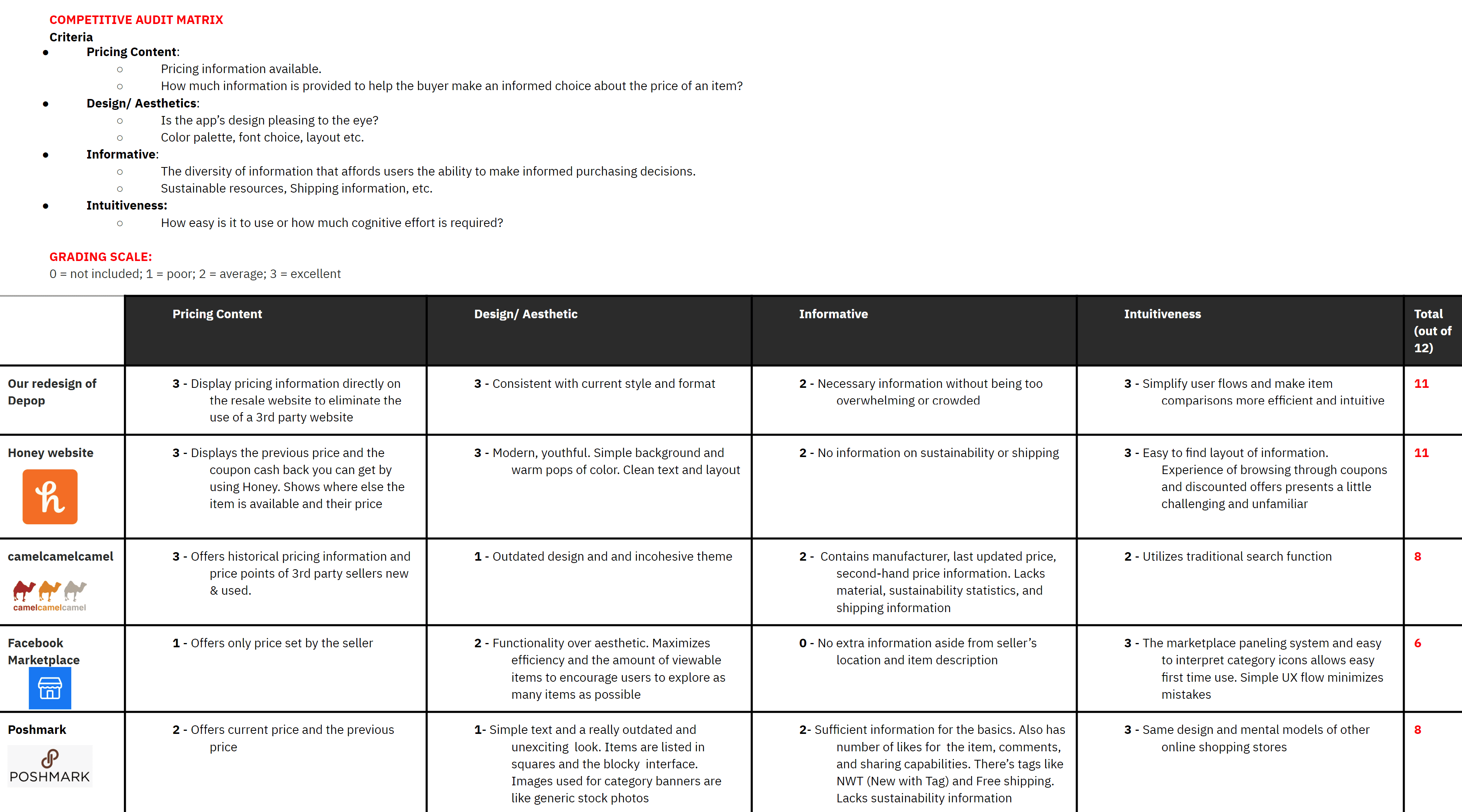
What we learned
Honey: Excellent model for in-context browser pop-ups and comparisons.
CamelCamelCamel: Strong price history visualization and third-party seller comparisons.
Depop: Great visual UI but lacks transparency tools.
Opportunity: Bring the best of price-comparison tools into Depop’s item page without disrupting the existing flow.
THE GOAL
How might we surface trustworthy price comparisons directly on Depop so buyers don’t need to leave the platform to research?
SOLUTION
Lowering the burden of research by presenting pricing information directly to buyers in a side-by-side comparison pop-up and an added pricing history feature.
DESIGN PROCESS
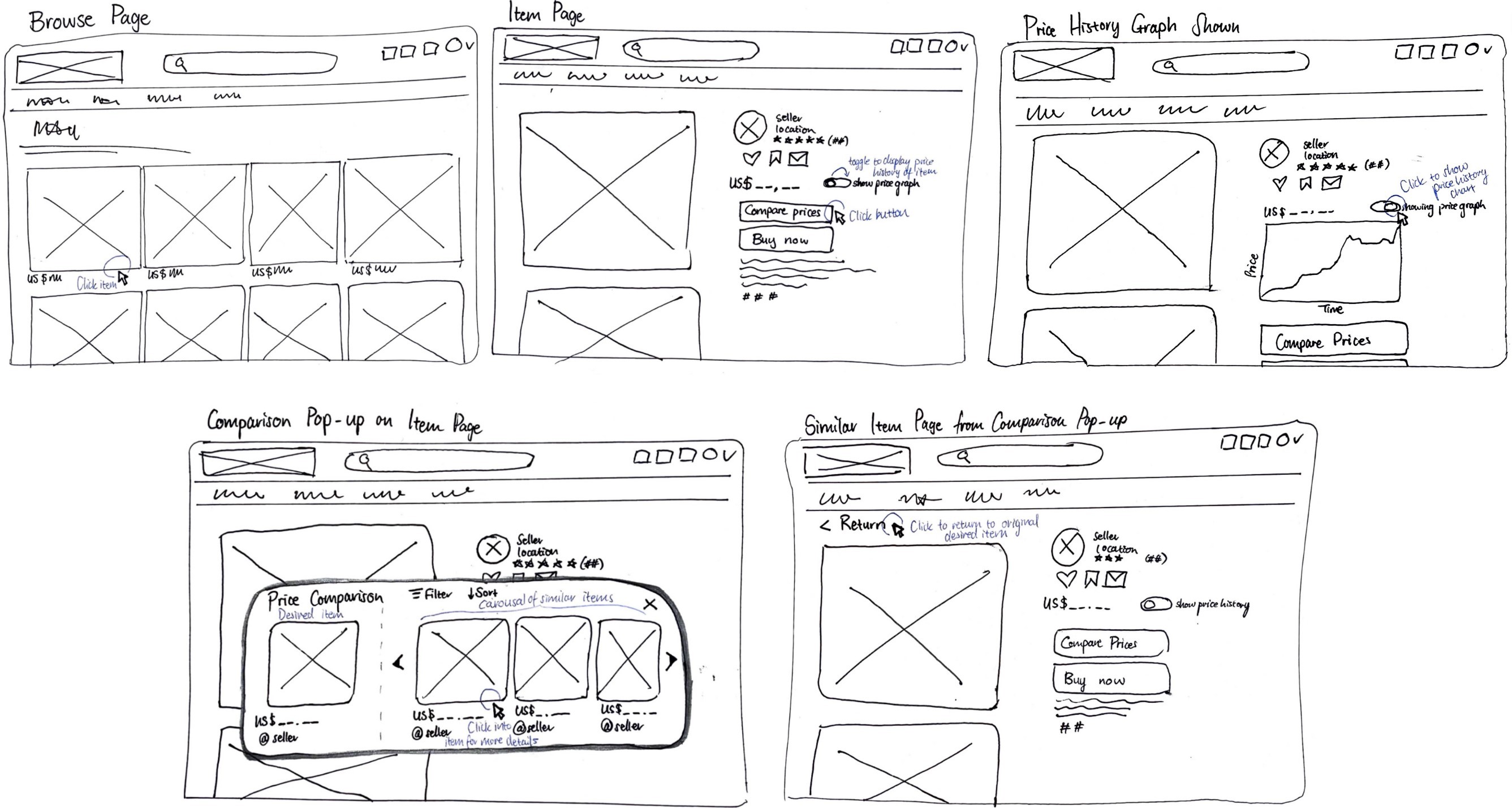
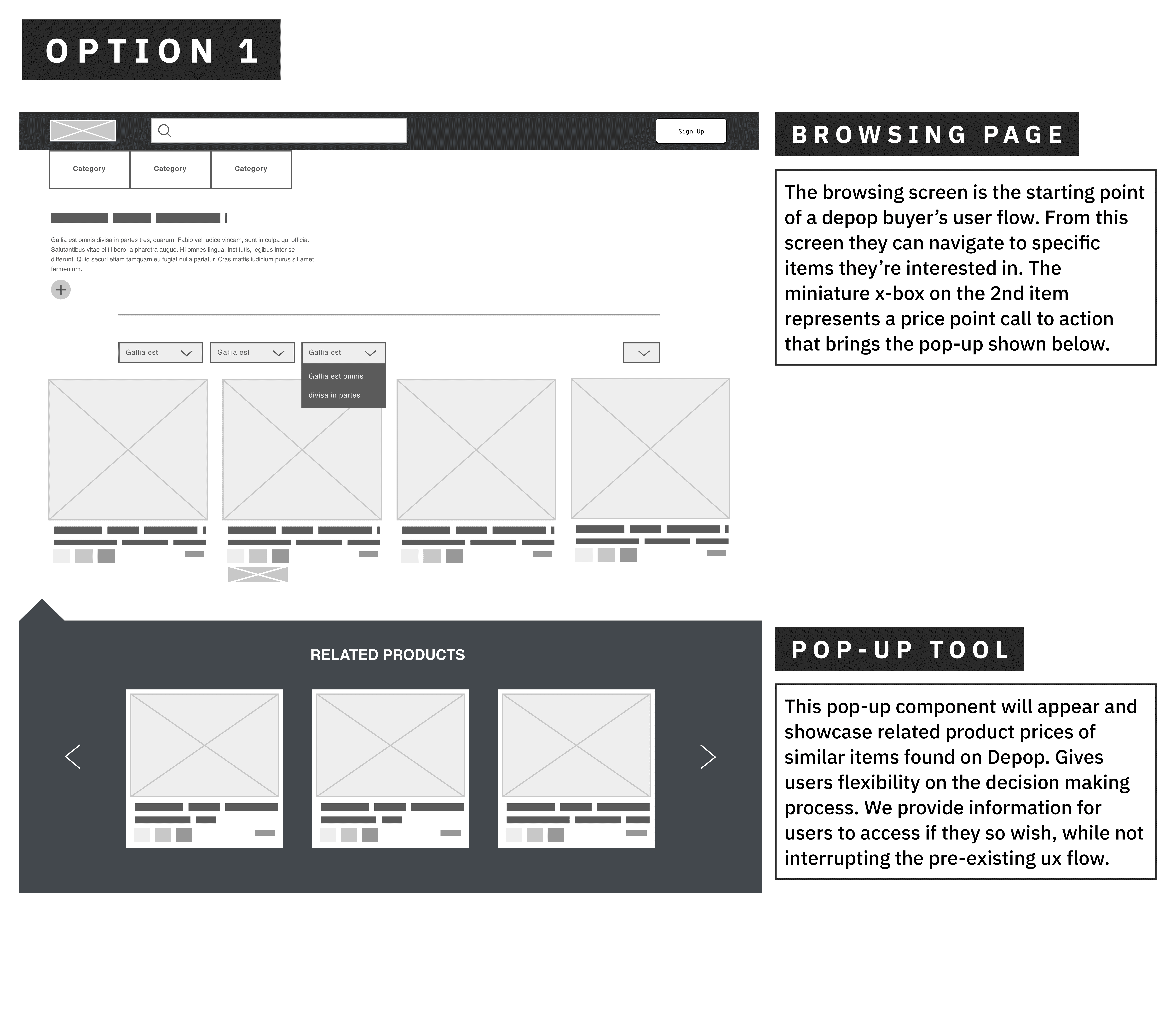
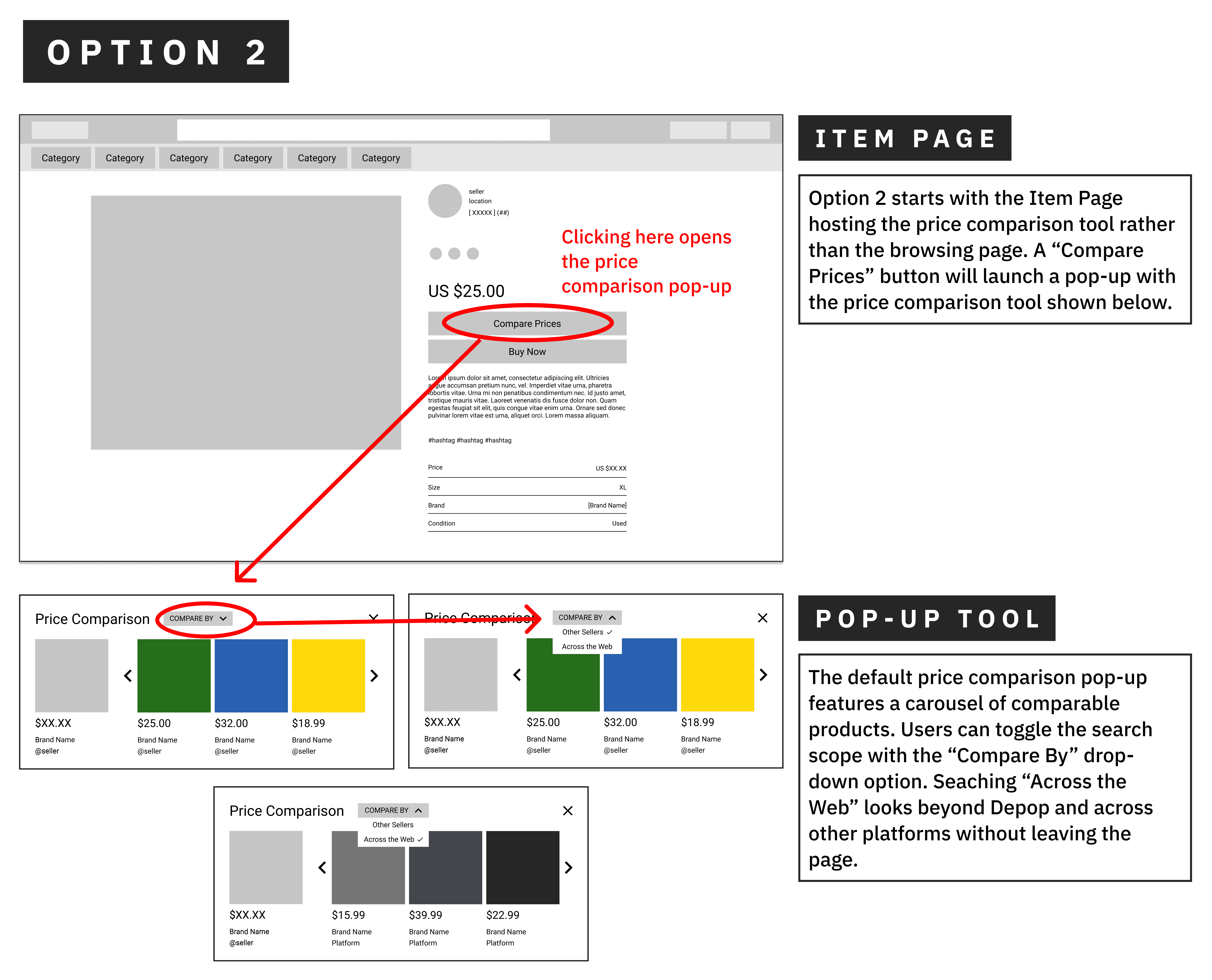
UI sketches
I created initial sketches and wireframes to explore how we could integrate comparison tools without overwhelming users or altering Depop’s visual style.
Low-fidelity prototypes
We tested two directions:
Inline comparison module
Pop-up price comparison tool
User feedback
Users preferred Option 2, the pop-up, because:
Matches Depop’s existing mental model
Doesn’t clutter the screen
Makes comparisons feel optional but accessible
High-fidelity prototype
We blended the strengths of both early concepts into one system:
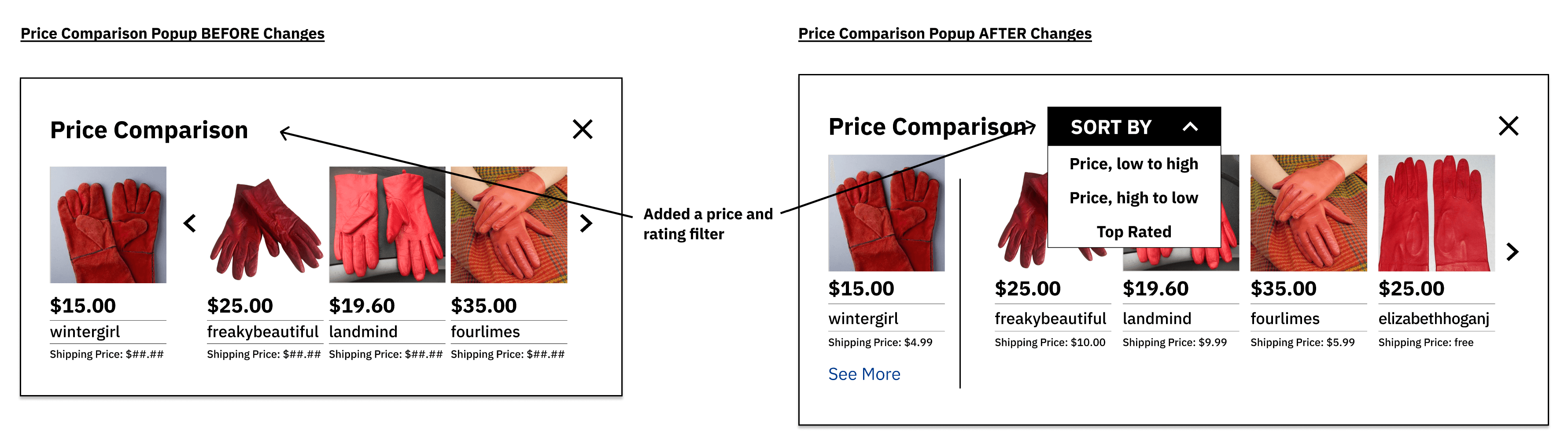
Key UI improvements after testing
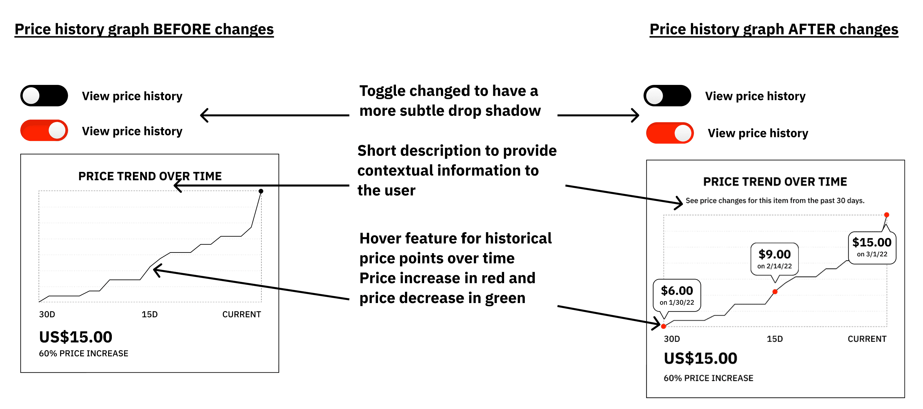
Added clearer explanations of price history
Added interaction cues (hover dots) for price drops
Tuned hierarchy so transparency does not overwhelm browsing
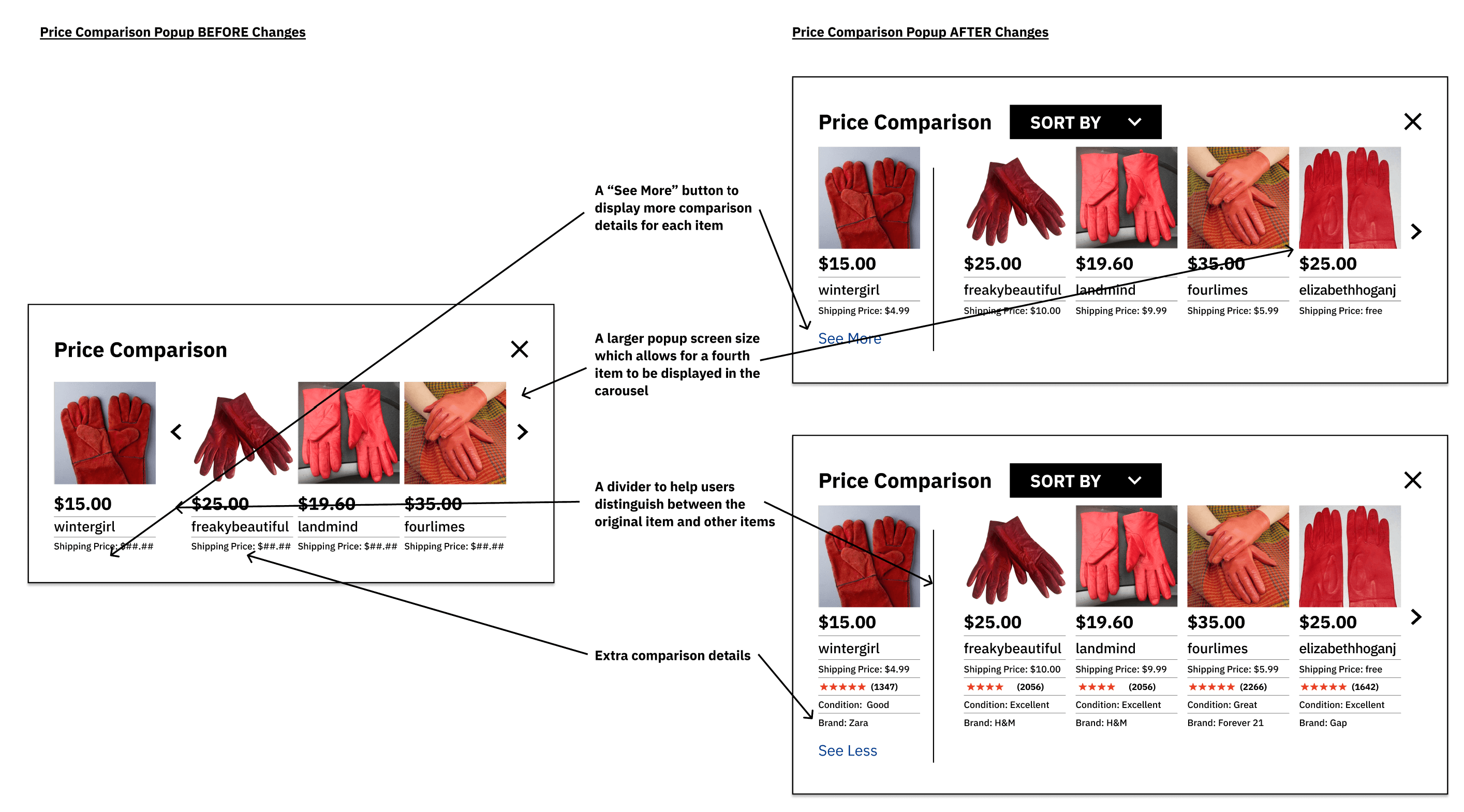
Finalized features
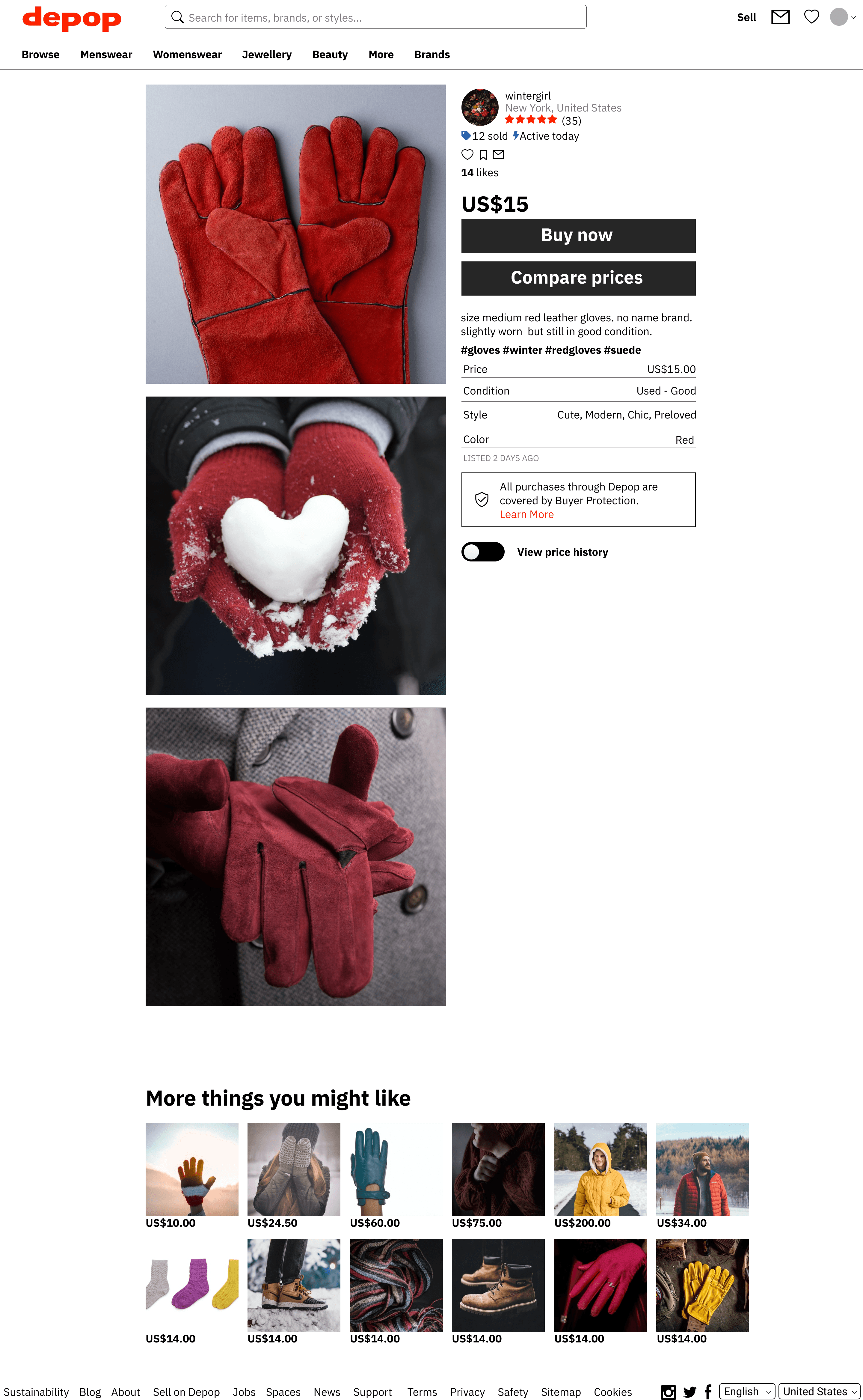
Price comparison pop-up
Shows similar listings across Depop with a quick fairness assessment.Price history graph
Visualizes how an item’s price has changed over time.“See More” details
Optional drawer for brand, condition, and ratings. Reducing information overload.Enhanced sorting filters
Helps users browse efficiently and understand pricing trends.
FINAL REDESIGN
We built a fully interactive redesign integrating transparent pricing directly into Depop’s item page without altering its core interface.
This solution equips buyers with trustworthy information while keeping them inside the platform.
Price comparison pop-up tool
Price history graph
Future plans
While our redesign focuses on Depop, the underlying tool could scale across resale platforms. With broader data integration, it could become a universal pricing transparency layer for sustainable shopping.
Our long-term goal is to standardize pricing fairness across resale markets and reduce “thrift inflation,” making sustainable shopping accessible again.
REFLECTION
This project strengthened my belief that sustainable design requires transparency, not just aesthetics. Leading the team through research, wireframing, and synthesis taught me to balance user trust, business implications, and ethical consumption👕.
Key Achievements
The beauty of the project is that we were able to give and receive feedback throughout. Here are a few positive reactions from our incredible peers and mentors: