
Pixley's Oddities
skill
Web Design
focus
Service
Role
Project Lead
Year
2022

"An Inclusive, Femme, Queer, and Non-Binary Art Space for Curiosities, Tattoos, and Piercings" -Simone Weinstein, Owner
Overview
Background
Pixley’s Oddities is a one-of-a-kind studio in San Diego—a hybrid of alternative art, taxidermy, tattoos, piercings, and community workshops. As a proudly femme, queer, and non-binary-owned space, it offers a safe, expressive environment within an industry that has historically centered white, male-dominated aesthetics and norms.
This project originated in a UX/Product Design studio at UC San Diego, where my team and I partnered directly with Simone, the owner, to redesign the shop’s website, https://pixleysoddities.com/. We worked closely to understand their mission, brand personality, and functional needs, ultimately creating a design system that better reflected the shop’s identity and supported business goals.
Why this client?
We chose Pixley’s Oddities because it represents the kind of community-grounded, inclusive design we believe in. Supporting a small business that intentionally creates space for femme, queer, and non-binary individuals is aligned deeply with my own values and design philosophy. I wanted to help amplify a space that prioritizes belonging, self-expression, and accessibility.
It was also a creatively exciting challenge: Pixley’s blends morbidity and whimsy—preserved specimens alongside pastel tattoos, oddities alongside joy. Translating that personality into a cohesive digital experience required thoughtful narrative design, visual balance, and careful attention to tone.
Redesign objectives
Pixley’s Oddities already had a functioning website where customers could book appointments, browse classes, and shop online. However, the site didn’t fully reflect the studio’s personality, values, or offerings.
After several meetings with Simone, we identified three core opportunities for improvement:
Make the retail shop more visible and appealing
The existing site underplayed the in-store experience and unique “oddities” products. The redesign needed to highlight the shop as a central part of the business.
Showcase classes and workshops more clearly and compellingly
Workshops were difficult to discover and lacked the excitement and clarity needed to encourage sign-ups.
Improve the appointment-booking experience
Tattoo and piercing bookings were functional but not intuitive. We aimed to streamline navigation and reduce user confusion.
Redesign Priorities
Through our conversations, the client emphasized several non-negotiables for the brand:
A visual style that blends nostalgia, morbidity, and whimsy
Hot pink and blue as the core brand colors
A stronger reflection of the studio’s values around inclusivity, acceptance, and queer identity
These priorities guided every design decision, from layout and typography to interaction patterns and visual storytelling.
Design process
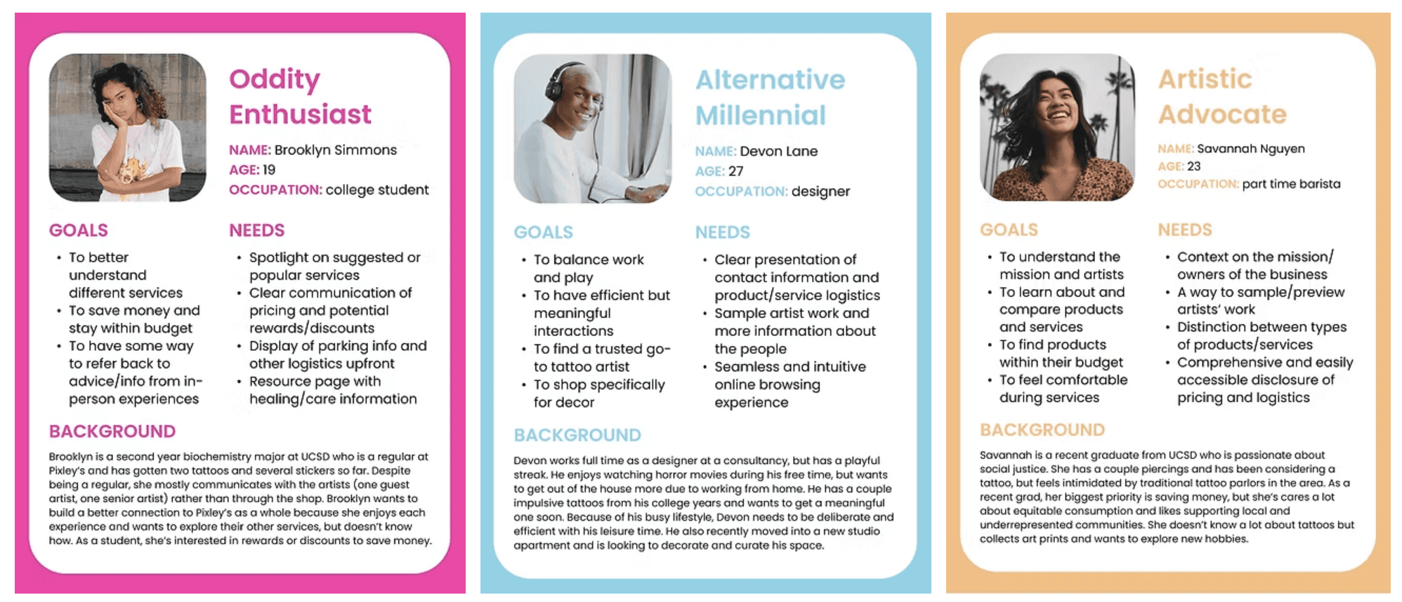
Understanding the customers
With our redesign goals established, we shifted focus to understanding the people who interact with Pixley’s Oddities. We conducted user research and interviews to identify motivations, behaviors, and expectations. From this data, we developed three primary personas representing the shop’s key user groups.
Using these personas, we mapped out user scenarios and journeys to explore the context in which customers discover classes, book tattoos/piercings, or browse the shop’s oddities. These insights helped align user needs with business priorities.
Competitive analysis
To position Pixley’s Oddities effectively, we analyzed competitors with similar services or aesthetics: Guru Tattoo, Sideshow, Enigma, Little Dame, and Memento Mori. We compared each across four criteria: Branding, Features & functionality, Site architecture, and Content.
Branding
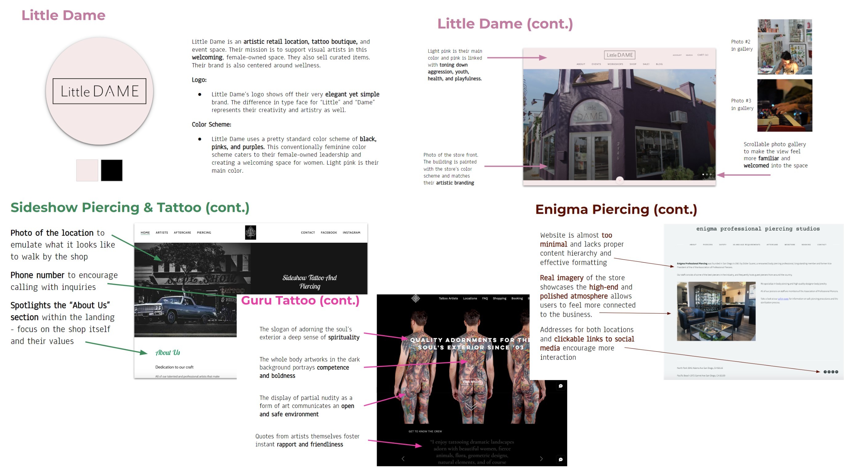
Pixley’s has a uniquely inclusive and narrative-rich identity. Inspired by Sideshow’s focus on storytelling, we planned to foreground Pixley’s mission and history on the homepage. Competitors such as Enigma and Little Dame also highlight their physical space, so we incorporated photos of Pixley’s storefront and interior to help new visitors visualize the studio.
Features & functionality
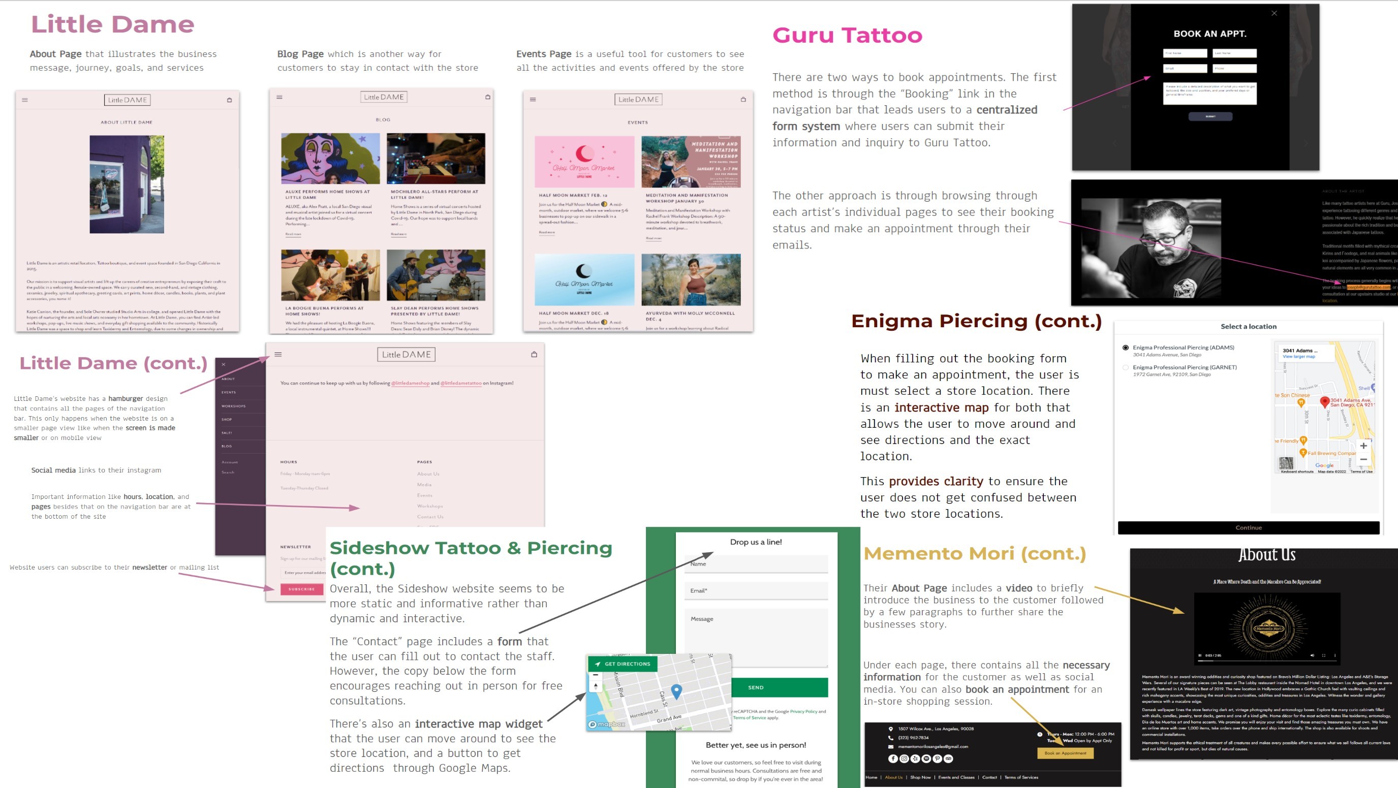
Across all competitors, foundational pages like About and Contact were standard, making them essential for our redesign. We drew inspiration from Little Dame and Guru Tattoo for how they structured their retail experience and appointment booking.
Site architecture
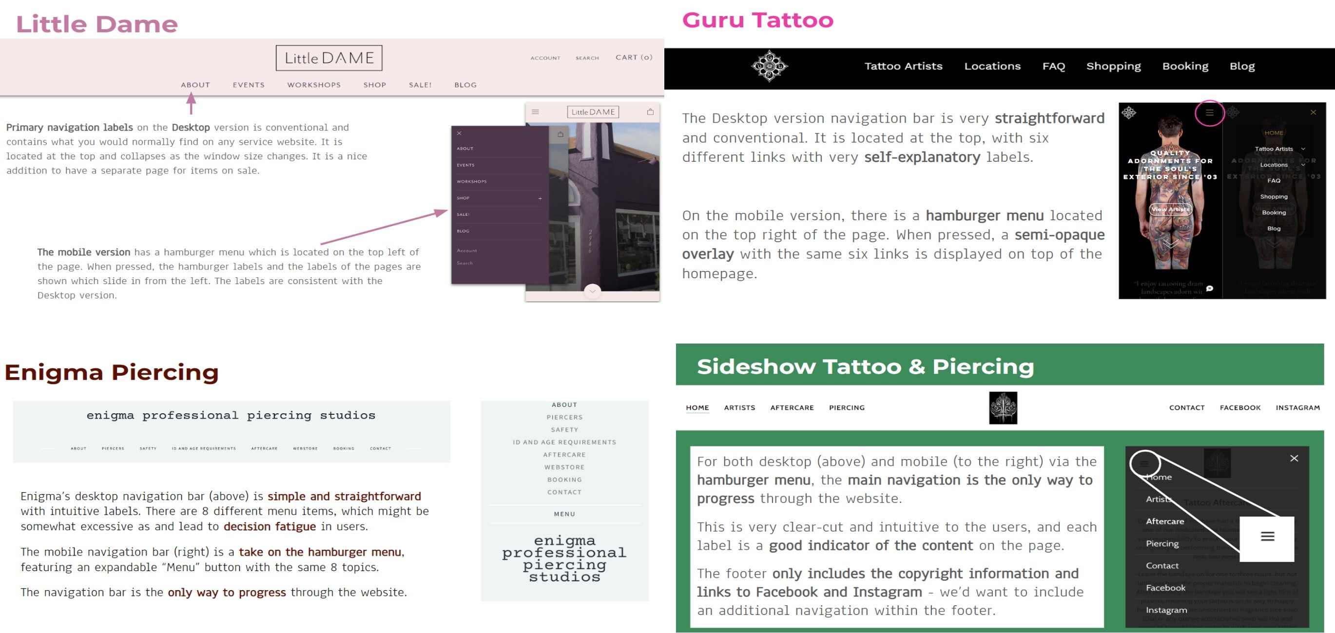
The competitive patterns made it clear that navigation should be organized by service type: Tattoos, Piercings, Classes, and Oddities. We also identified the need for a functional footer to support wayfinding. Competitor analysis consistently reinforced the value of clear, minimal information architecture to reduce cognitive load and decision fatigue.
Content
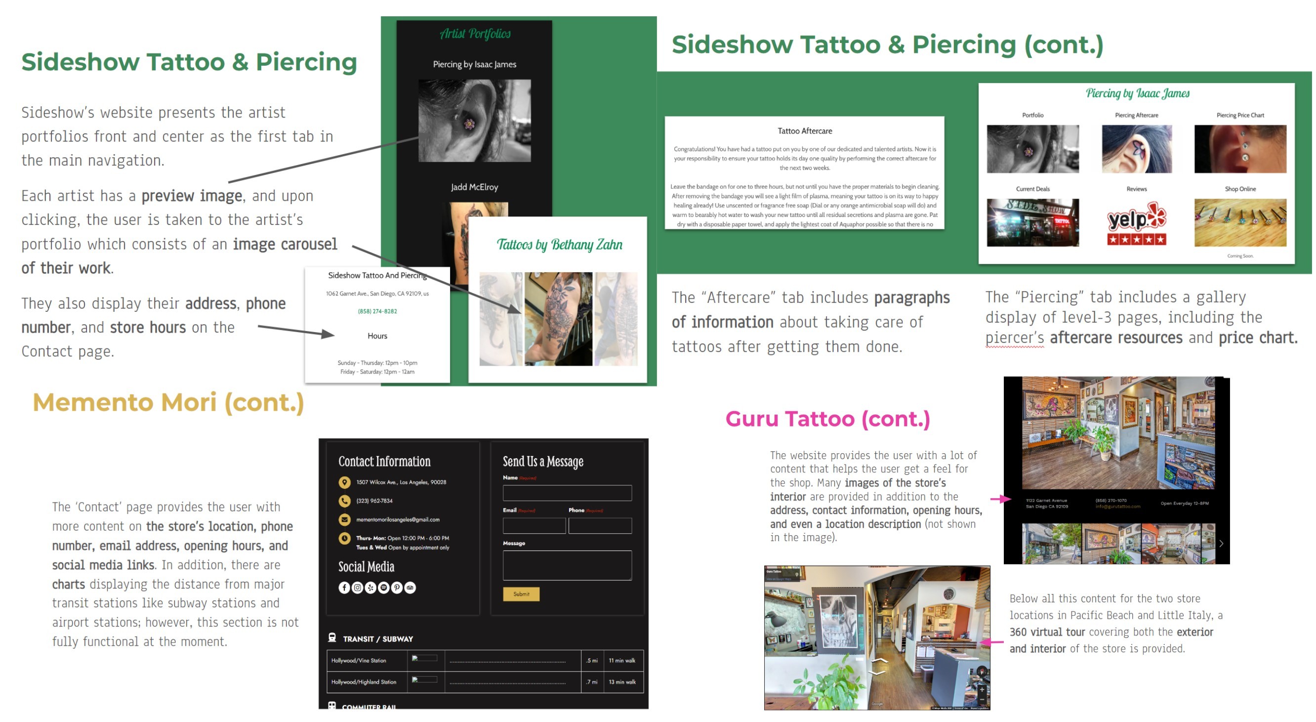
Competitors frequently use image galleries to help visitors explore the artist's work and understand the shop environment. We adopted this approach while also ensuring core information was clearly accessible across the site.
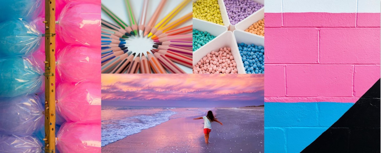
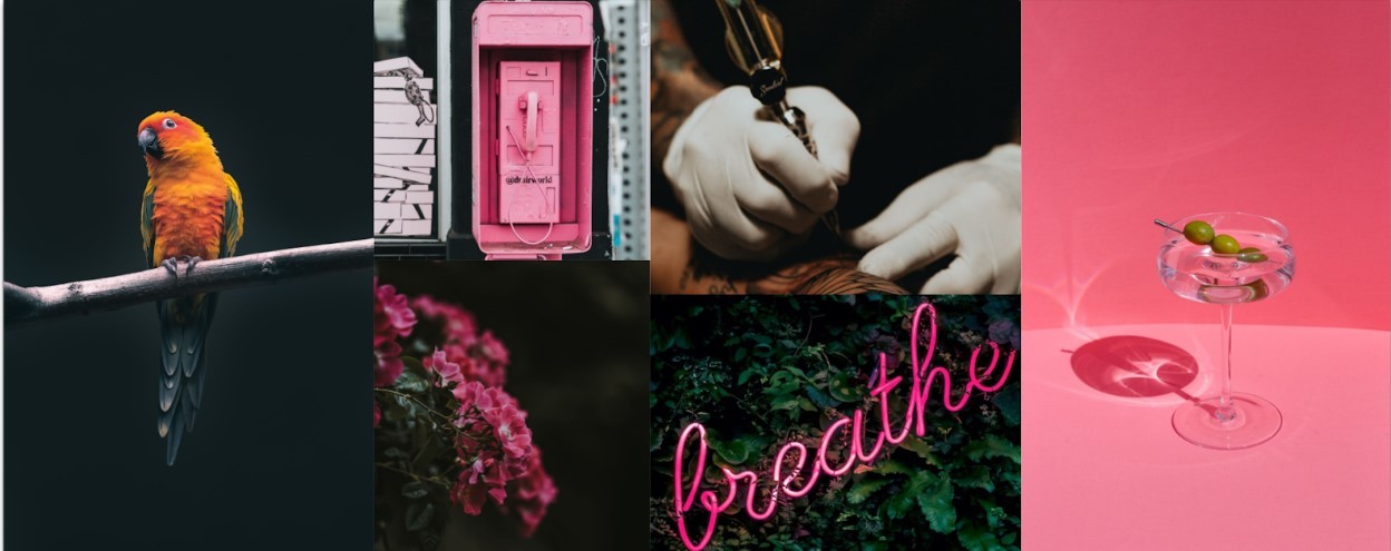
Mood boards
To explore visual direction, we created three mood boards based on the client’s key brand qualities: Playful, Alternative, and Creative.
Playful used Pixley’s signature hot pink and light blue to evoke optimism, nostalgia, and friendliness.
Alternative brought in darker tones and mystique, balanced by pink accents to maintain brand cohesion.
Creative incorporated retro, slightly unsettling, pop-art-inspired elements to reflect the shop’s quirky personality.
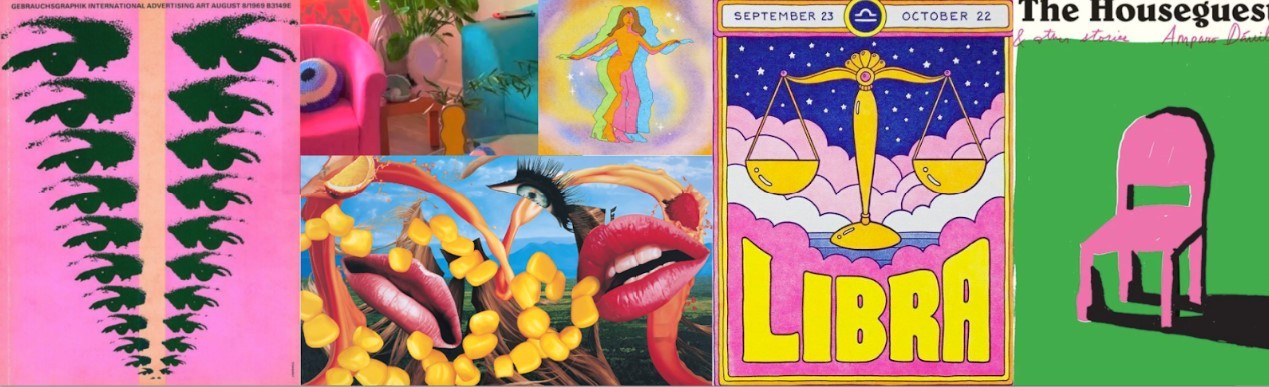
After reviewing the options with the client, they gravitated toward the color palette of Playful and the atmosphere of Creative. A combination that ultimately guided the visual direction of the redesign.
Creative brief
To align expectations and ensure clarity throughout the project, we prepared a detailed creative brief for the client. It covered the potential product definition, project scope, objectives, target users, personality and tone, anticipated challenges, and early sketches. This brief served as the foundation for shared understanding before moving into design.
Definition of the Potential Product
With the client’s approval, we defined the redesign as:
An online embodiment of Pixley’s Oddities: a digital space that reflects their unique brand, service offerings, inclusive mission, and nostalgic–morbid–playful aesthetic. The redesign will strengthen the studio’s relationship with customers by balancing the whimsical with the alternative.
Sketches
We presented mobile sketches to give the client an early sense of direction for structure, visual hierarchy, and personality.
They responded positively to the proposed layouts, confirming we could proceed confidently into prototyping.
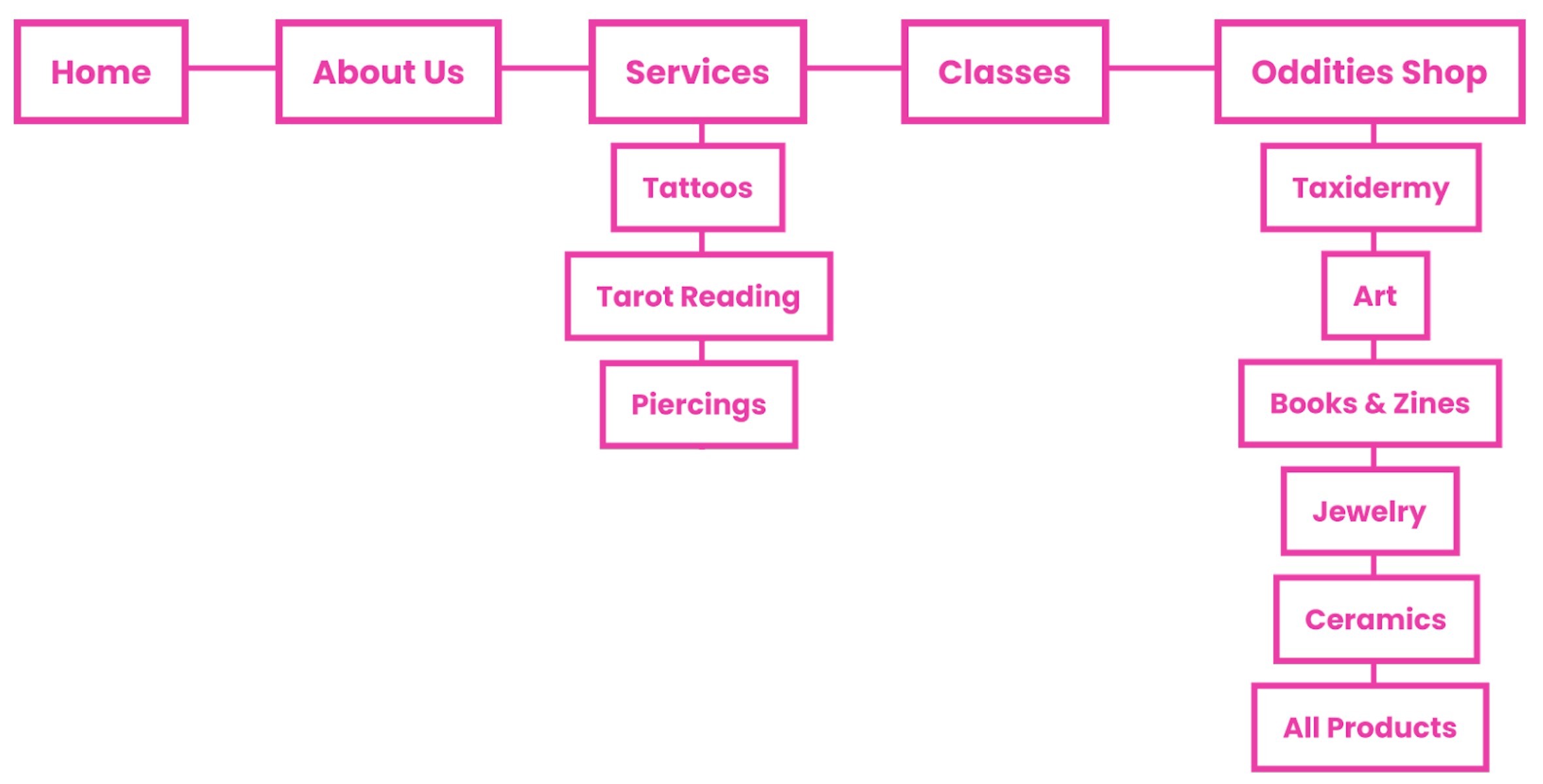
Site architecture
We created a detailed site map to establish a logical information hierarchy and ensure intuitive navigation across pages.
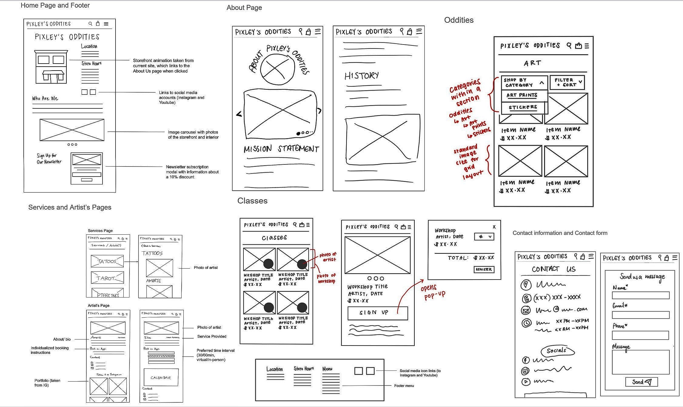
Low-fidelity prototypes
Using the site architecture and approved sketches, we developed low-fi wireframes for both mobile and desktop. These prototypes focused on structure, flow, and content placement without visual styling.
Mobile
Desktop
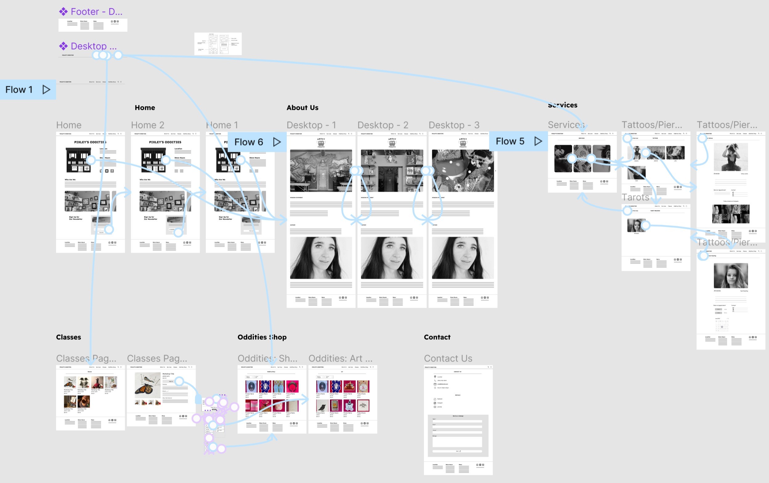
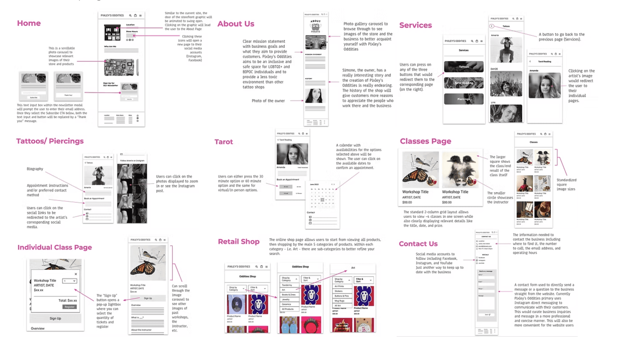
Functional specifications (Mobile)
We documented functional specs for the mobile experience to articulate interaction patterns, component behaviors, and content rules. We wanted to ensure alignment between design and development teams.
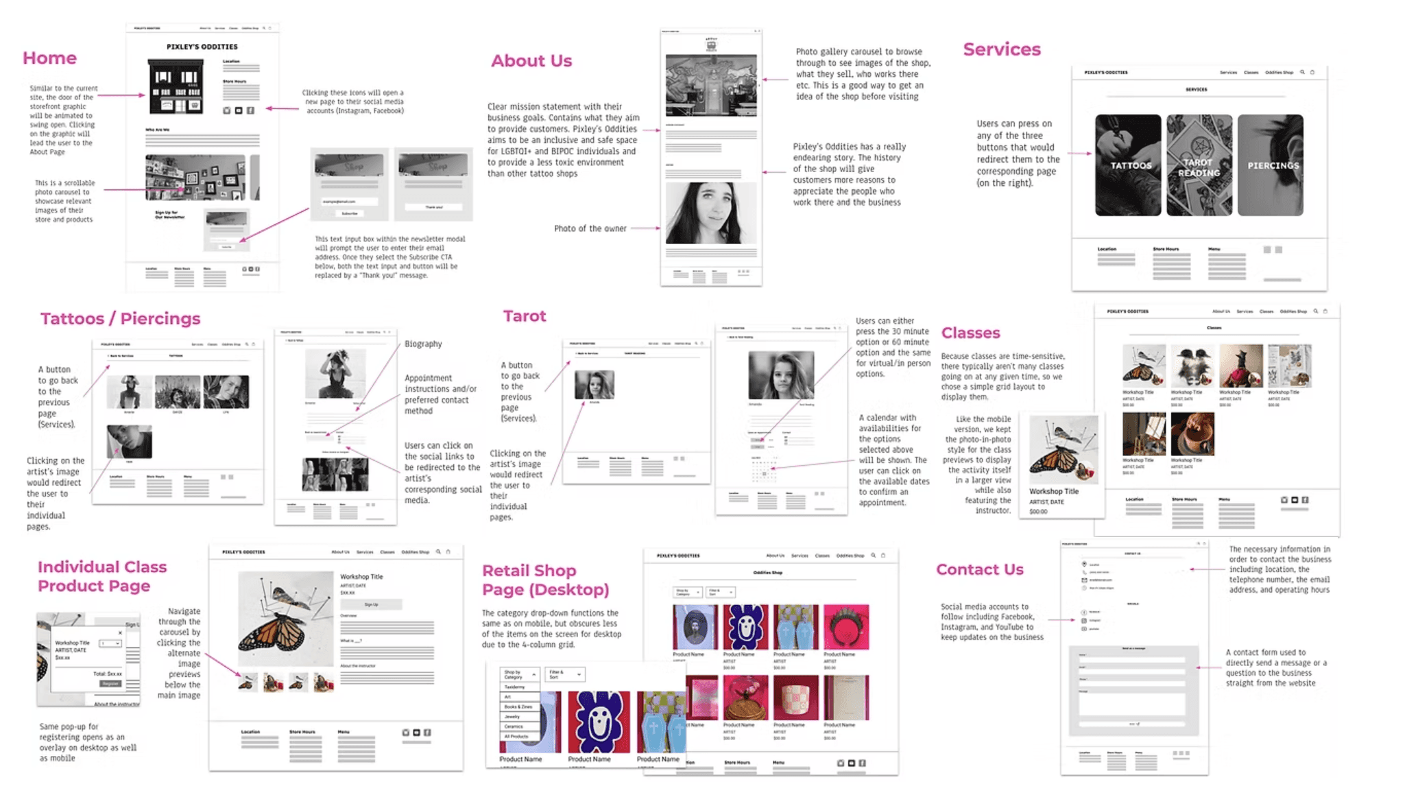
Functional specifications (Desktop)
We then expanded the specifications for desktop, accounting for layout adaptations, content scaling, and desktop-specific user needs.
User testing
We conducted usability testing with the low-fidelity prototypes across mobile and desktop. Participants completed key tasks (e.g., exploring classes, booking services, browsing oddities) and provided feedback on clarity and navigation.
Key Insights
Users found the layout intuitive and much easier to navigate than typical tattoo or oddities sites.
Artist portfolios were especially helpful in understanding each service.
Users recommended adding a search bar and shopping cart for a smoother retail experience, which are features we planned to incorporate in later iterations.
Development plan
Before moving into high-fidelity prototyping, we created a development plan to coordinate responsibilities, track progress, and manage version control. This alignment was essential given that our team was working remotely, and it ensured consistent communication across design, research, and testing.
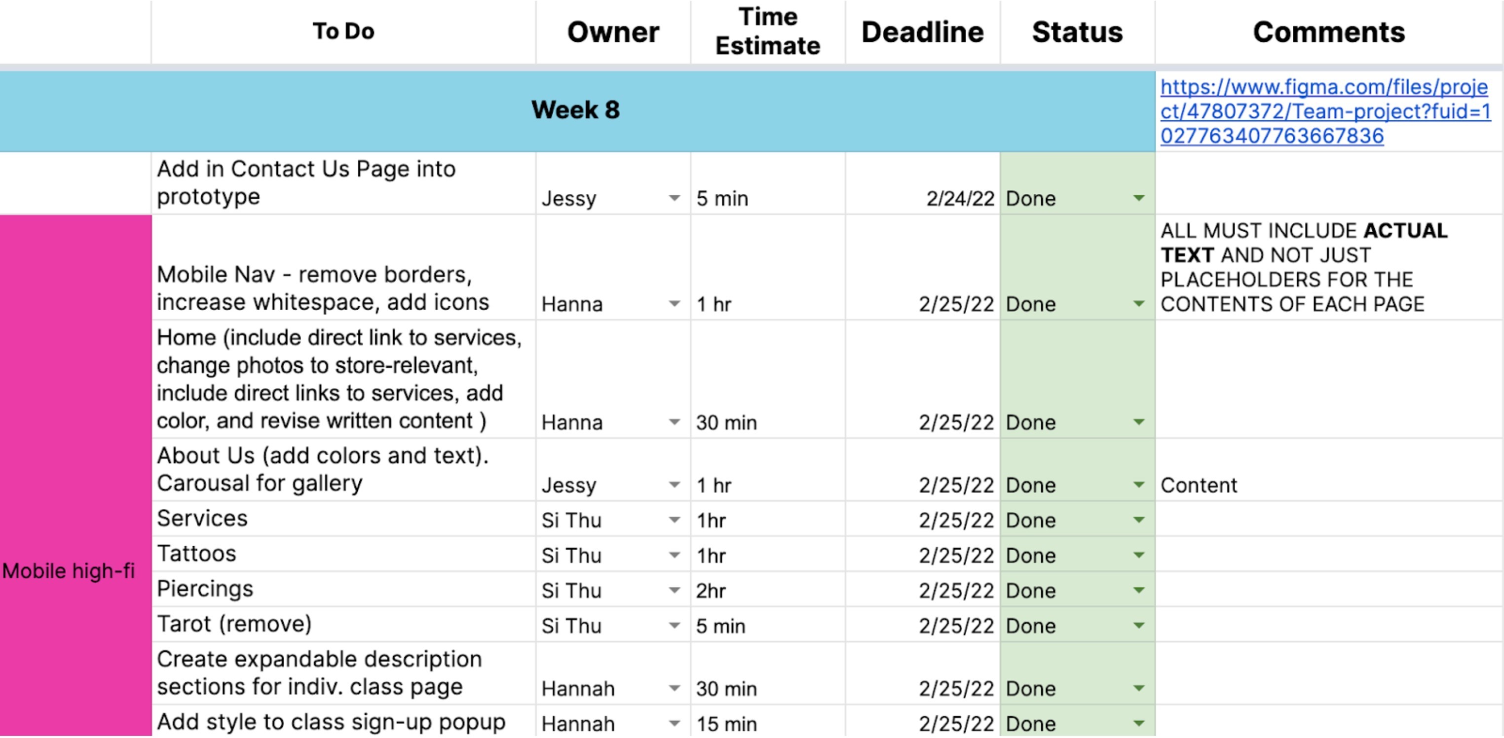
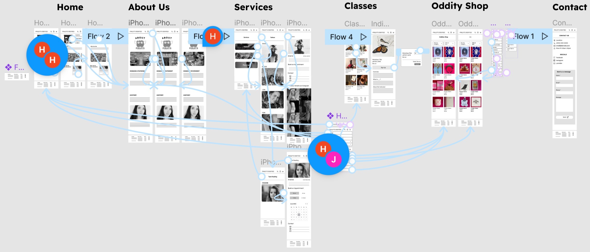
First high-fidelity prototype
Using the client-approved specifications, we built high-fidelity mobile and desktop prototypes in Figma. We experimented with typography, color, and visual patterns to capture the balance of playful and morbid that defines Pixley’s Oddities.
Before & after improvements
Through user testing and critique, we identified opportunities to refine visual polish, hierarchy, and usability. Key improvements included:
Refined color palette & optimized negative space
We adjusted the color scheme and reworked spacing to create a layout that felt more intentional, readable, and aligned with Pixley’s identity, striking a better balance between playful color and alternative aesthetic.
Reworked homepage hero & improved gallery interactions
We removed the radial header and elevated “Who Are We” as the main homepage slogan to immediately capture Pixley’s ethos.
We redesigned the photo gallery to use arrows and dots as clear signifiers on desktop, while keeping mobile interactions natural to touchscreen mental models (horizontal swiping).
This distinction improved clarity and reduced confusion across device types.
FINAL HIGH-FIDELITY PROTOTYPE
We shared the completed high-fidelity mobile and desktop prototypes with Pixley’s Oddities, and the client was genuinely thrilled with the results.
Website
Reflection
Conclusion
Working with a real client made this project especially rewarding. Although we were not able to fully develop the site, our prototypes directly influenced updates made to Pixley’s existing website. The client incorporated several of our recommendations, such as emphasizing service categories and adding staff photos to the homepage, demonstrating that our work had a meaningful impact. They also expressed interest in collaborating again on future design projects. By that measure, the project was a true success.
Key achievements & takeaways
As project lead, I learned how to manage client communication and ensure alignment from brief to delivery. The client’s adoption of our redesign affirmed the project’s value and deepened my commitment to inclusive, community-driven design 💖.
